Brand & website · 2026

Jazz It Up

Find your pink thread

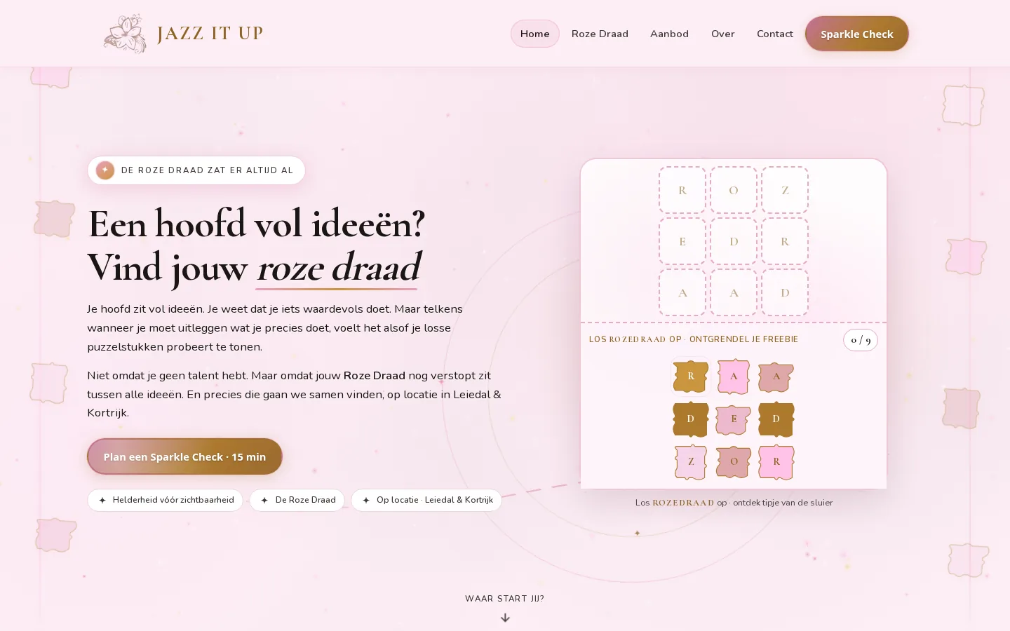
Jazz It Up helps entrepreneurs with a head full of ideas find their pink thread. The original logo stayed. We designed the brand language around it, built a warm conversion-focused website on Nexovix and turned the puzzle into a real site feature: solve ROZEDRAAD and unlock a glimpse of the thread.

Branding Brand language UX/UI design Website Interactive tools Copy structure Nexovix CMS
Jazz It Up
The Jazz It Up offering

What Jazz It Up offers

Key figures from jazzitup.be: free Sparkle Check, interactive puzzle, three phases and a clear coaching journey.

Free
Sparkle Check · 15 min
9
ROZEDRAAD puzzle pieces
3
Phases in De Roze Draad
Nexovix
CMS platform
The challenge

The challenge

Jasmijn already had a recognisable logo, but the brand and site had to feel like her coaching: playful, intuitive and clear. Visitors needed to understand De Roze Draad at once, recognise themselves in loose puzzle pieces and book a Sparkle Check with low friction. The puzzle could not be decoration; it had to be a feature that makes the brand language tangible.

Our approach

Our approach

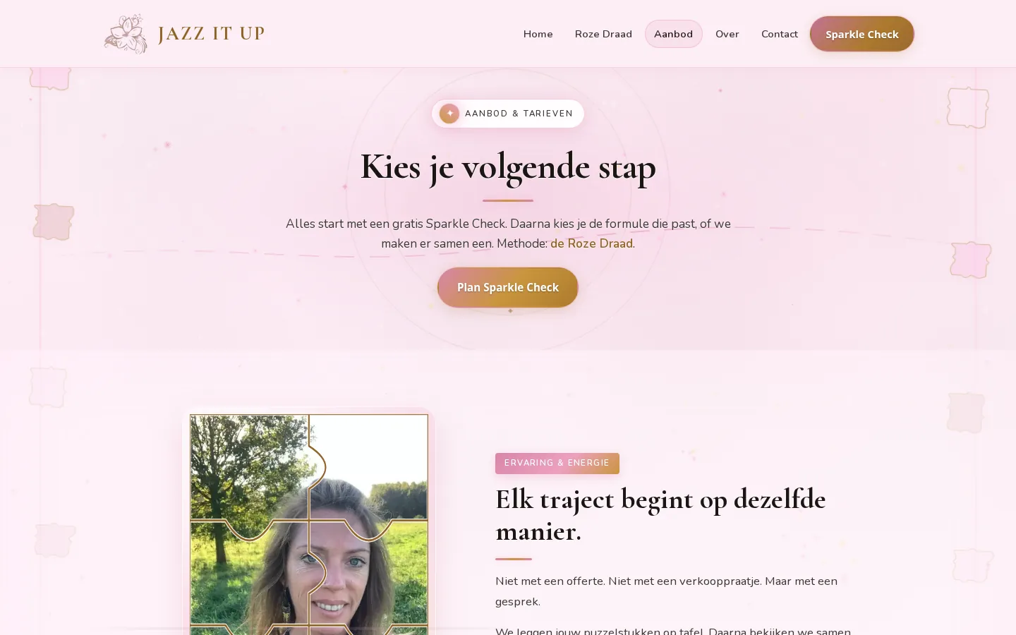
We started with brand strategy on the existing logo: pink instead of red, gold for sparkle, ink for calm. Then UX and copy for the full customer journey: hero with De Roze Draad, the interactive ROZEDRAAD puzzle, recognition, three method phases and an offer from Sparkle Check to programme. The site runs on Nexovix and is built for clarity before visibility, playfulness and conversion.

Pink thread. Not red.

For Jazz It Up we designed a brand language that feels as playful and intuitive as the coaching itself. Pink stands for soft strength. The puzzle for clarity. Sparkle for the next step.

The existing logo, flower and gold, stayed the anchor. Around it we built copy, colour and rhythm: De Roze Draad, puzzle pieces on the table, clarity before visibility. That language runs through the hero, method, offer and the interactive puzzle on jazzitup.be.

Pink, not red

Pink as soft, feminine, intuitive strength and playfulness, not a hard corporate red thread.

Puzzle pieces on the table

Make everything visible first. Only then see the connections. The puzzle is both the method and the site feature.

Clarity before visibility

No extra marketing layer. First a story that holds, then communicate from that core.

Sparkle & movement

Every session ends with a concrete next step. The Sparkle Check is the low-friction entry.

UX & interactive product

The ROZEDRAAD puzzle: brand language you can assemble

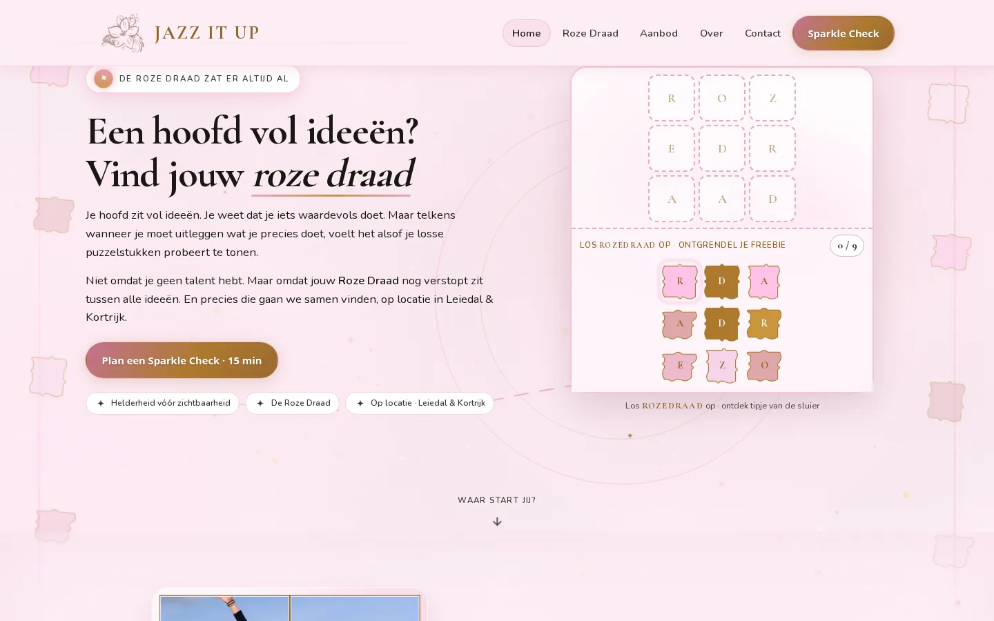
The puzzle is not decoration on jazzitup.be, that was the design goal. We built an interactive ROZEDRAAD game in the hero: nine pieces, one word, and a freebie once the thread becomes visible.

Jazz It Up talks about loose puzzle pieces. So we let visitors place those pieces themselves. Drag letters into the grid, see the progress and unlock a glimpse of the thread. Playful enough to linger, serious enough to prove the brand promise: clarity appears when everything is on the table.

Designed and built by Branding Guru

Interactive grid

Nine puzzle pieces, one word: ROZEDRAAD, with clear 0/9 progress.

Brand language as play

The loose-pieces metaphor becomes a feature, not just copy.

Freebie flow

Solve the puzzle and leave an email for a glimpse of the thread.

Conversion alongside

From puzzle to Sparkle Check in the same hero, without breaking the playfulness.

Outcome

A brand and website that make De Roze Draad tangible, with an interactive puzzle, clear CTAs and a free Sparkle Check you can book right away.

  • Brand language and positioning around De Roze Draad, based on the original logo
  • Colour palette, visual style and copy: pink, gold and ink
  • Website design and development on Nexovix
  • Interactive ROZEDRAAD puzzle as a site feature, with a freebie flow
  • Homepage, method, offer, about and Sparkle Check
  • Responsive desktop and mobile layout
  • Copy structure around clarity before visibility

Jazz It Up

Based on the original logo we designed the visual language: ink for calm and trust, logo pink for playfulness and connection, gold for sparkle and conversion. Everything aligns with coaching that puts clarity before visibility.

Colour palette: Pink, gold and ink in one playful visual language.

Want a brand and website with a language of its own?

From an existing logo to brand language, an interactive feature and a live site, we're happy to think along on your next project.