The challenge
An artist has seconds. Fans want to listen immediately, not scroll a biography. The site had to feel dark and cinematic, put THERAPY and the catalogue first, then lead naturally into tour and merch, in EN, NL and FR.

Music, tour & merch. One voice.
Nash Vandrick is Remco van der Schans reinvented: from years on stage with Rascal to personal music spanning pop, country, hip-hop and rock. We built nashvandrick.com as a fan-first platform: listen, feel the tour and buy merch without noise.
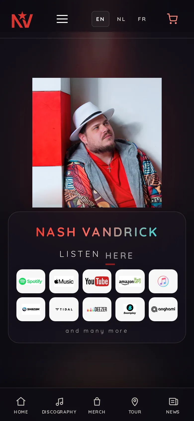
What nashvandrick.com does
Core of the artist site: listen immediately, feel the single, then tour and merch as the next step.
An artist has seconds. Fans want to listen immediately, not scroll a biography. The site had to feel dark and cinematic, put THERAPY and the catalogue first, then lead naturally into tour and merch, in EN, NL and FR.
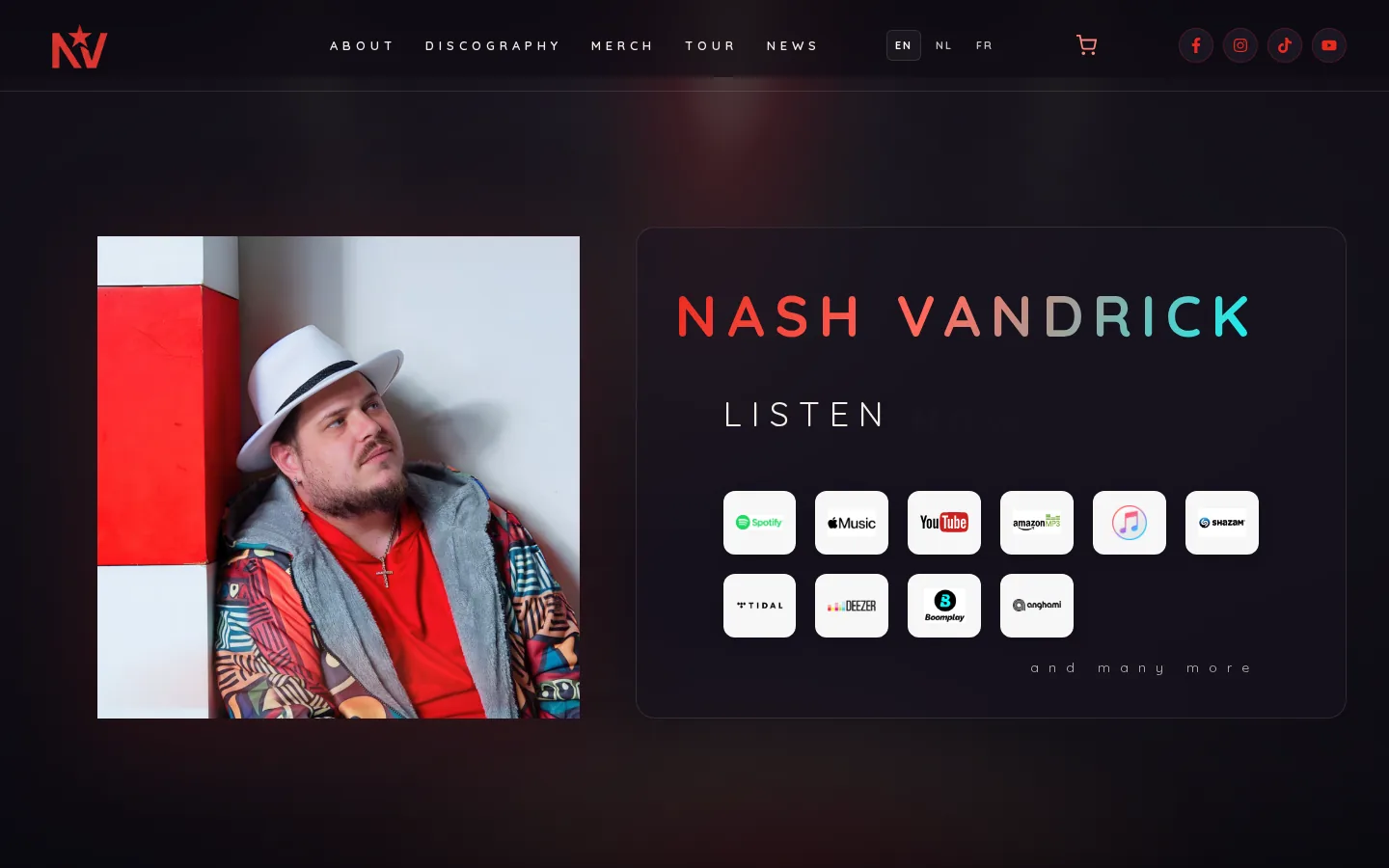
We started with the artist identity: NV mark, red-to-cyan gradient and a black stage. The homepage opens on Listen now with streaming buttons, then singles, live energy and merch. Every block has one action: play, reserve or shop.
For Nash we wrote a brand that puts raw emotion on stage: black as canvas, red as heat, cyan as spotlight.
The NV mark and gradient name keep the artist recognisable on photo, merch and site. The tone is personal, not party-line.
Music is the product. Everything on the site serves listening.
Dark stage, sharp accents, photos that feel close.
From Rascal to Vandrick: less show, more truth.
Tour, merch and news without crowding out the music.
Fans come for music, not a portfolio. We built the site as a stage: stream buttons first, then story, live and merch.
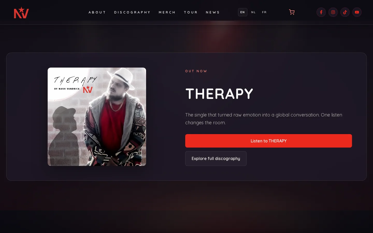
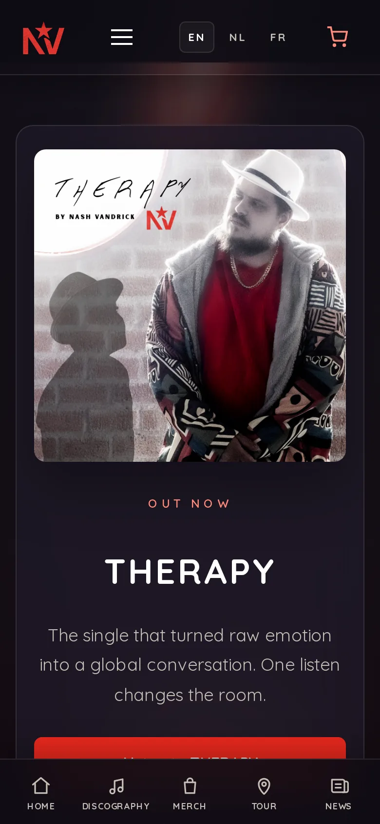
THERAPY sits centre stage as the conversation starter. The listen grid links Spotify, Apple Music and more. Tour and merch follow without interrupting the music.
Designed and built by Branding Guru
Listen now is the hero, not an afterthought.
Red/cyan on black: stage light, not a corporate template.
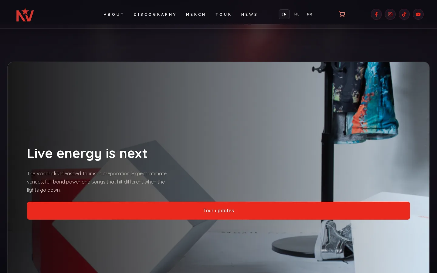
Live energy ready for Unleashed.
Kids hoodie and fanwear with the same look.
An artist site that lets fans listen immediately, then naturally leads into tour and merch.
Black stage, red as energy, cyan as spotlight. The NV mark and gradient name keep Nash recognisable from stream to merch.
Real screenshots from nashvandrick.com, desktop and mobile.
We're happy to think along on your next project, from branding to live product.