
Brand & website · 2026

Taart op Maat

Your celebration. Our cake.

Taart op Maat makes artisanal fruit tarts and celebration cakes, from a strawberry classic to a Christmas bûche with mirror glaze. We built the brand and taartopmaat.com: a festive site where visitors see the collection, feel the atelier and submit their cake wish.

Branding Brand language UX/UI design Website Copy structure Conversion
Taart op Maat
The Taart op Maat offering

What taartopmaat.com makes clear

Core of the site: artisanal cakes, a visible collection, seasonal creations and one warm path to your order.

Made to order
Every cake to your wish
Collection
Fruit, celebration & Christmas
Atelier
Craft from the kitchen
1 form
From wish to proposal
The challenge

The challenge

Selling artisanal cakes needs taste, trust and an easy next step. Visitors had to see at a glance that everything can be made to order, which creations are ready, and how to share date, guests and flavour. No cold webshop feel, with atelier warmth.
Our approach

Our approach

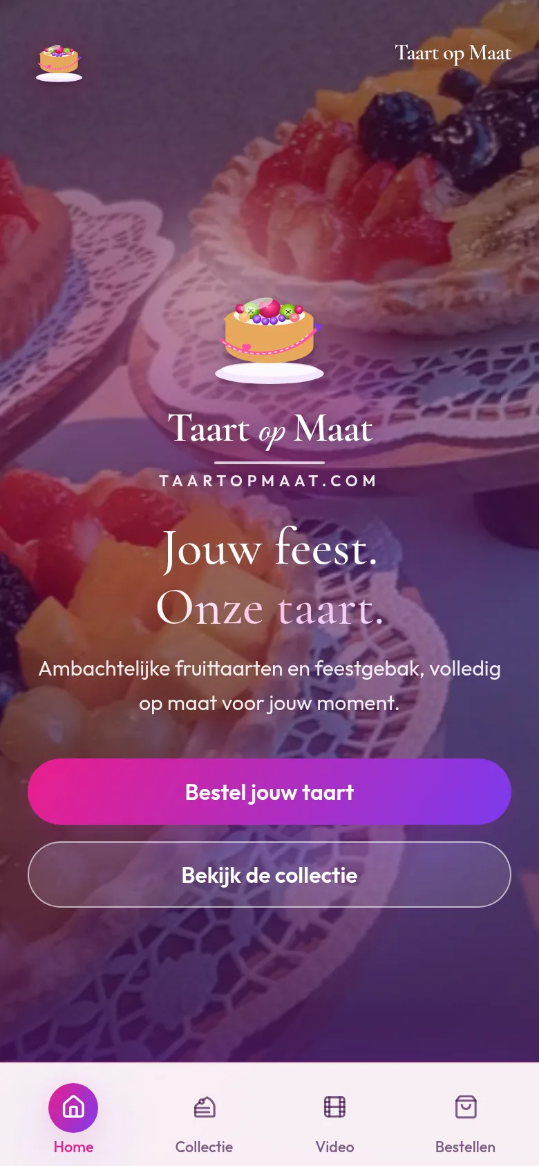
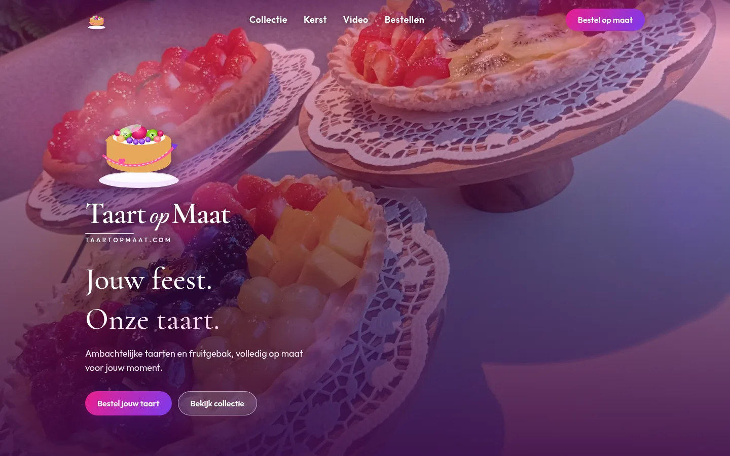
We started with the brand: a fruit-tart mark, pink-to-purple gradient and the promise Your celebration. Our cake. The site follows that energy: a hero with fresh tarts, collection cards, Christmas selection, atelier videos and an order form that feels like a talk with the baker.

Festive. Artisanal. Made to order.

For Taart op Maat we wrote a brand that gets to celebrate sweet work: warm, glamorous and close to the kitchen.

The tagline is Your celebration. Our cake. The mark is a fruit tart. That language runs through the hero, collection, Christmas and ordering on taartopmaat.com: short, appetising, human.

Celebration

Every cake belongs to a moment. The site should make that moment feel bigger.

Craft

Handmade work from the atelier kitchen, down to glaze and fruit detail.

Made to order

No off-the-shelf boxes: your taste, our hands.

Warm-premium

Festive without kitsch: pink-purple, cream and real cake photography.

UX & ordering

From collection to cake wish in one festive path

Ordering a cake should feel like looking forward to a party, not like checkout. We built taartopmaat.com as a path: taste and imagery first, then Christmas or a classic, then share your wish.

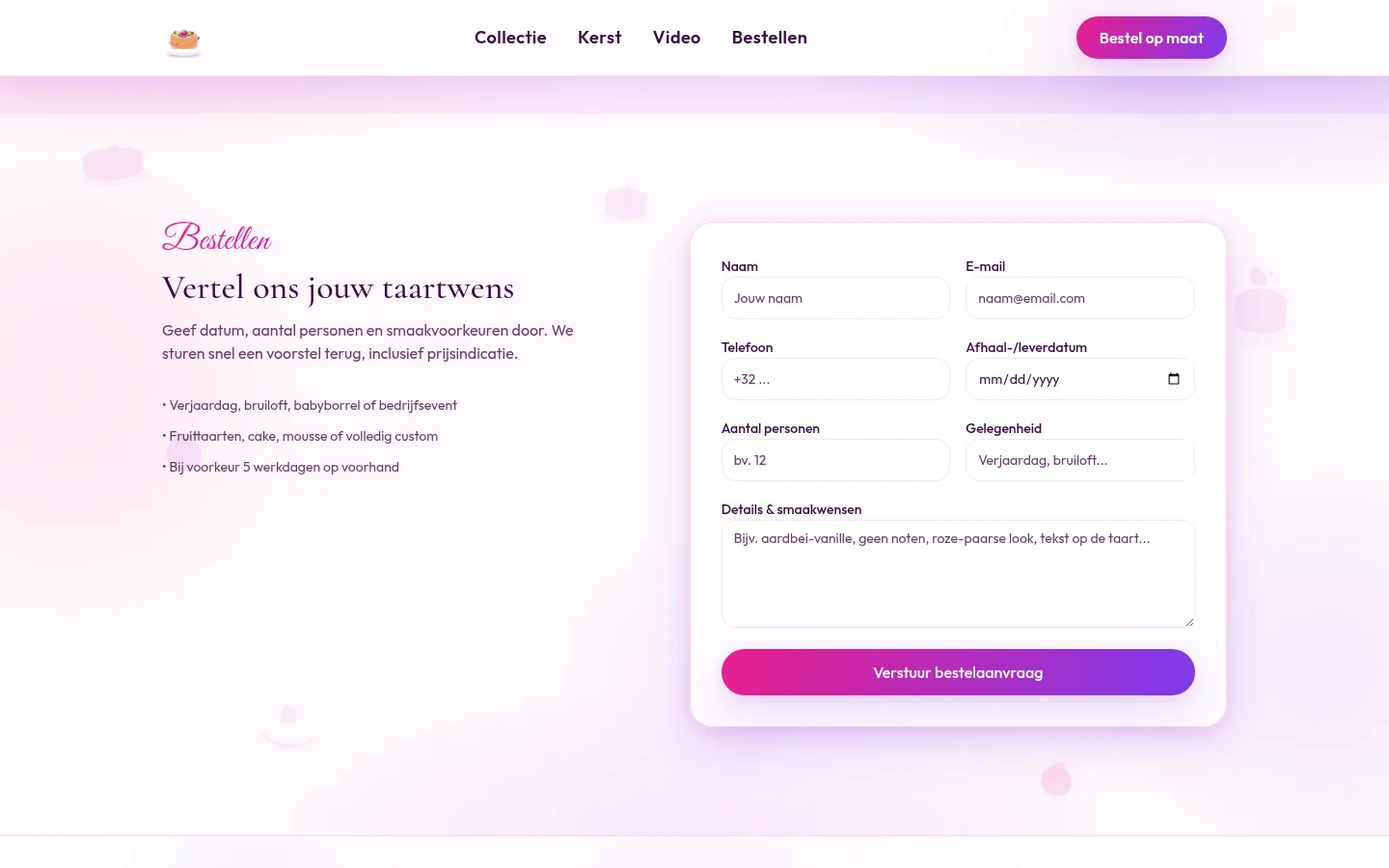
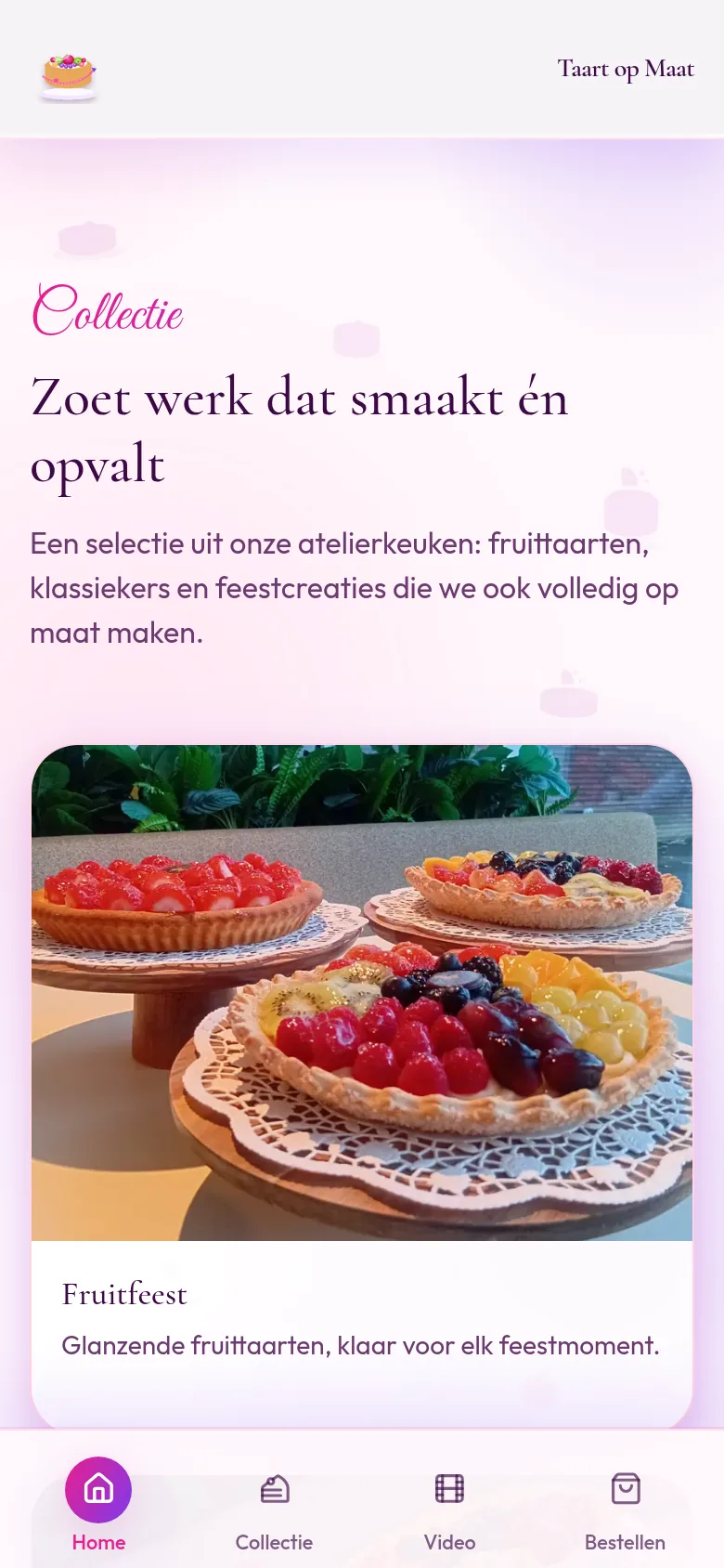
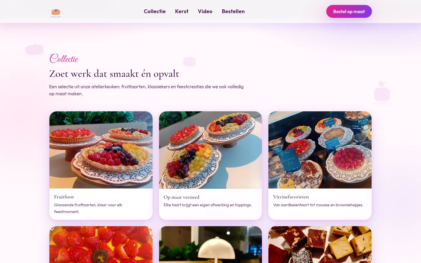
The collection shows fruit feast, strawberry classic and seasonal work side by side. The holidays section puts Christmas bûches with mirror glaze in the spotlight. The order form asks for date, guests and flavour so the atelier can send a proposal quickly.

Designed and built by Branding Guru

Order made to measure

Clear CTAs to the wish form throughout the journey.

Collection first

Imagery and taste before price: visitors choose with their eyes.

Christmas included

Seasonal bûches as a holiday layer beside the core collection.

Atelier close by

Kitchen videos make craft tangible.

Outcome

A brand and website that make artisanal cakes tempting, with collection, Christmas selection and one clear order path.

  • Brand name, positioning and tone: Your celebration. Our cake.
  • Logo, colour palette and visual language: pink, purple and atelier cream
  • Website design and development of taartopmaat.com
  • Collection page with fruit tarts, classics and celebration creations
  • Seasonal section with made-to-order Christmas bûches
  • Atelier videos and order flow for cake wishes
  • Responsive desktop and mobile layout

Taart op Maat

Deep atelier purple for mood, bright pink for CTAs, cream for calm. The fruit-tart logo and wordmark keep Taart op Maat recognisable on a dark, festive site.

Colour palette: Pink, purple and atelier cream in one festive visual language.

Want a festive brand for an artisanal product?

From brand language and logo to a live site with a warm order flow, we're happy to think along on your next project.

WhatsApp