The challenge
Energy suppliers shout with deals and fine print. Volara wanted the opposite: short, concrete and Belgian. Visitors needed to see at a glance what Sparki is, when XL fits the roof, and how to book a free visit. No jargon, no pressure.


Energy that adds up.
Volara is the local energy guide in Belgium. The brand had to feel calm and clear, not like a teaser offer. We built the brand language and volara.be: one advice visit where you choose Sparki, solar with a battery, or both, even if you rent.
What Volara makes clear
Key figures from volara.be: no large upfront cost, a long term, and one visit where Sparki, XL or both are on the table.
Energy suppliers shout with deals and fine print. Volara wanted the opposite: short, concrete and Belgian. Visitors needed to see at a glance what Sparki is, when XL fits the roof, and how to book a free visit. No jargon, no pressure.
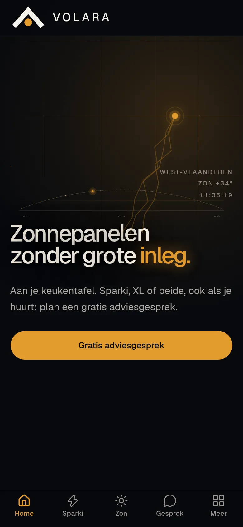
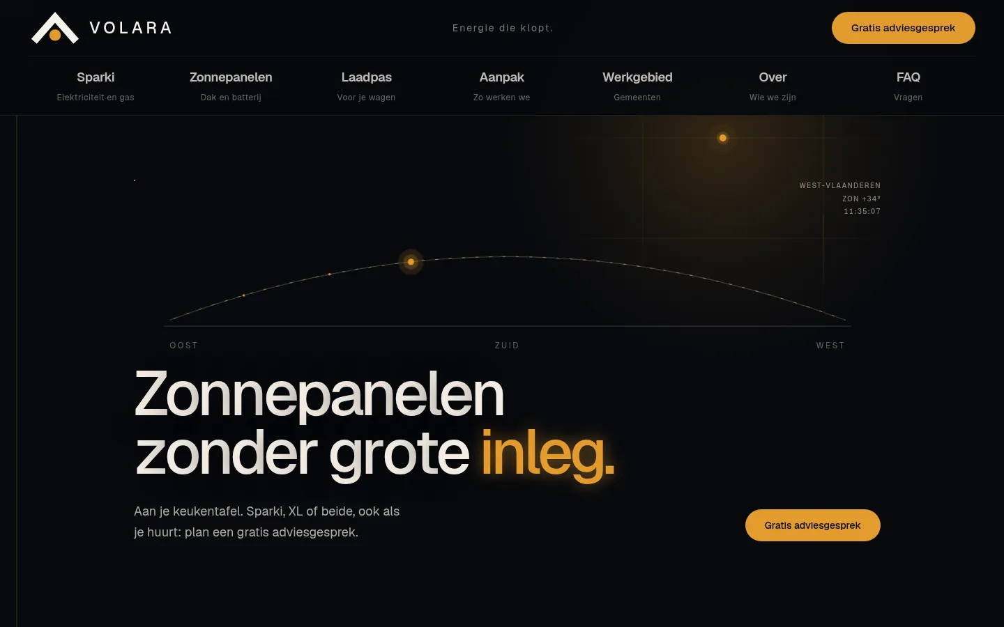
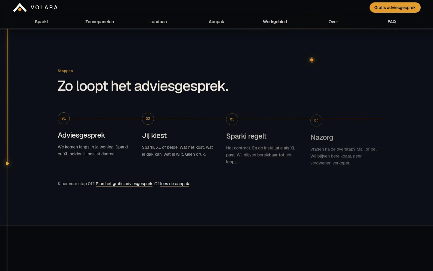
We started with the tone: calm, clear, warm-premium. Slate and amber as the palette, a roof mark as the logo, and copy that names every step. The site follows that order: a hero with the sun path, XL figures, three choices in one visit, and four steps from advice to aftercare. Every section ends on the same conversation.
For Volara we wrote a brand that explains energy without shouting. Slate for calm, amber for the next step.
The tagline is Energy that adds up. The logo is a roof with a sun. That language runs through the hero, product cards, steps and FAQ on volara.be: short, concrete, human.
No teaser deals. A calm tone is a calm mind for the customer.
Short sentences. Clear steps. Jargon only when we explain it at once.
Open to everyone, considered without becoming arrogant.
Local roofs and households. We visit people in West Flanders.
The site should not make the choice harder than the conversation. We built volara.be as a path: understand first, then choose, then book.
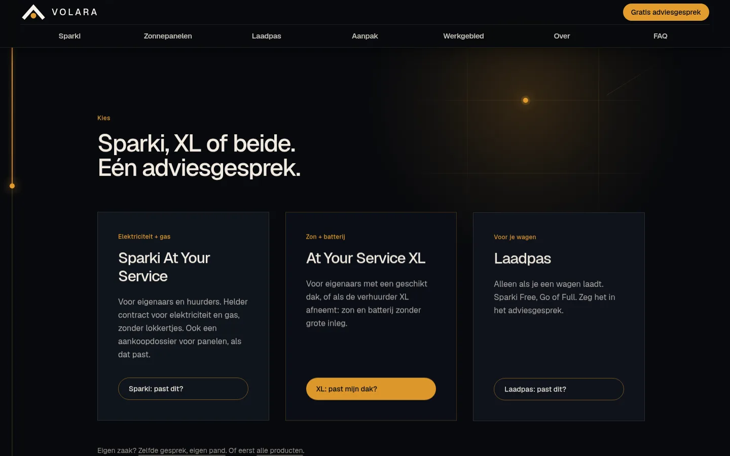
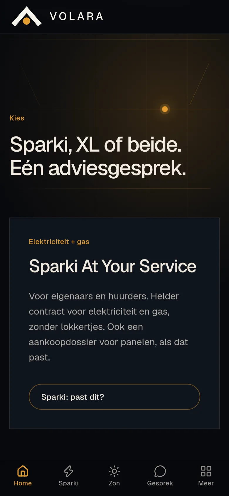
Sparki is electricity and gas, even if you rent. XL is solar and a battery without a large upfront cost, when the roof fits. The charging card only joins if there is a car. Those three cards sit side by side, with one amber button to the free visit.
Designed and built by Branding Guru
Short sentences, fixed steps, no exclamation marks in the offer.
Renters and owners see at once what applies to them.
One-off, all-in, term and index sit side by side.
Every section ends on the same free advice visit.
A brand and website that make solar without a large upfront cost explainable, with one advice visit as the only next step.
Slate for trust, amber for the sun and the CTA, paper for calm. The roof logo and the wide VOLARA wordmark keep the brand recognisable on a dark site.
Real screenshots from volara.be, desktop and mobile.
From tone and logo to a live site with one clear next step, we're happy to think along on your next project.